Measuring Dis/Similarities Between Objects (Cells) In 'n'-Dimensional Space
Cluster analysis works creating groups that have minimal variance (more similar) within and maximal dissimilarities between them.
Cluster analysis can work either agglomeratively or divisively.
Agglomerative methods begin with each individual cell representing a group (or cluster) and joins the two most similar to form a new cluster. This then repeats until all of the cells have been clustered into one group. I'll explain this more clearly with graphics below because it is the technique that I will be using classify my cells.
Divisive methods start with the entire set of cells, and subdivides it to maximize the dissimilarity between the 2 newly formed groups.
Distance Measures For Agglomerative Methods
How do you tell how similar two cells are? It should be pretty obvious from the previous graphs that you can tell clusters apart from each other because the points in space are closer to each other within a group and further apart between groups.
Using words like closer and further brings up the fact that you can see the distance these points are from each other in 'n'-dimensional space.
A common distance measure is Euclidean Distance, so I'll explain that first.
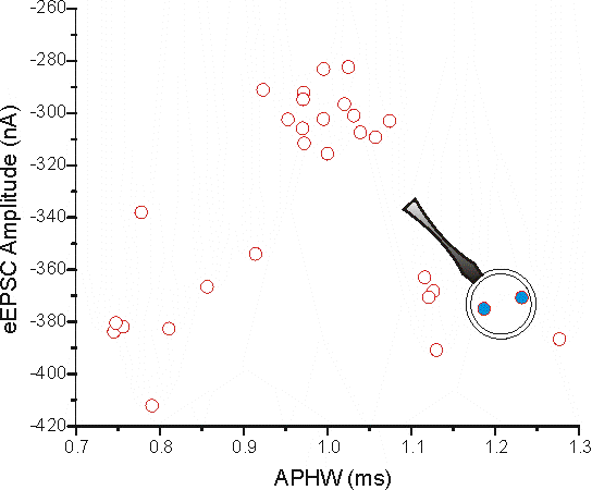
I'll use the 2D graph I created earlier because this is most probably what people are used to seeing in determining the distance between two points.
I've selected 2 points (in blue, cell 21 and 22 from the data) and blown up that part of the graph below and indicated on how to determine the Euclidean distance between the two points using Pythagora's Theorem (c2 = a2 + b2).
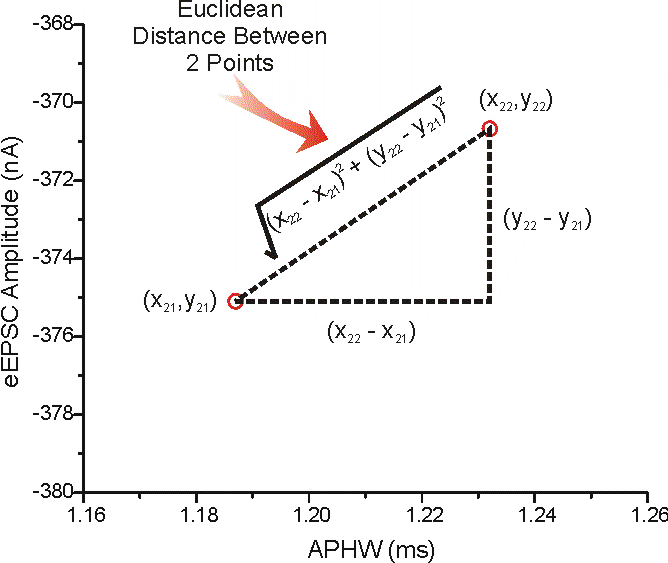
The values for these points are:
x21 = 1.23209 ms, y21 = -370.67322 nA
x22 = 1.18702 ms, y22 = -375.09202 nA
(x22 - x21) = -0.04507 ms & (y22 - y21) = -4.4188 nA
And the Euclidean Distance = 4.41903
Click here to see how to determine Euclidean Distance in 'n'-dimensional space
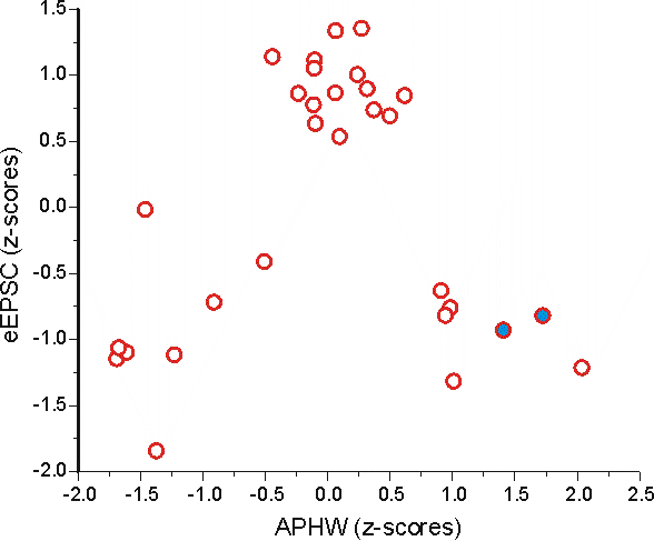
HEY!! - wait a minute here, the Euclidean distance is pretty much the same as the distance on the y-axis. Does this mean that the two points are different only in terms of their eEPSC amplitude? Well, no. We can see from this graph above that APHW can be a good discriminator between there being 3 vs. just 2 groups (as seen with eEPSC amplitude alone).
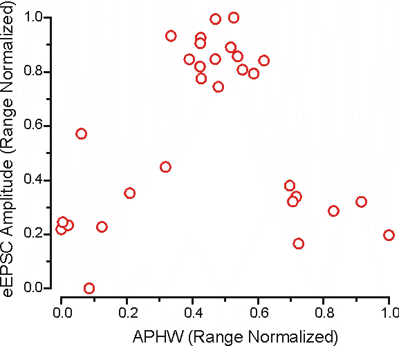
The distance measure is dominated by eEPSC amplitude just because the RANGE is larger. To drive this point home here's another graph that has the APHW axis scaled to the same range as eEPSC amplitude.
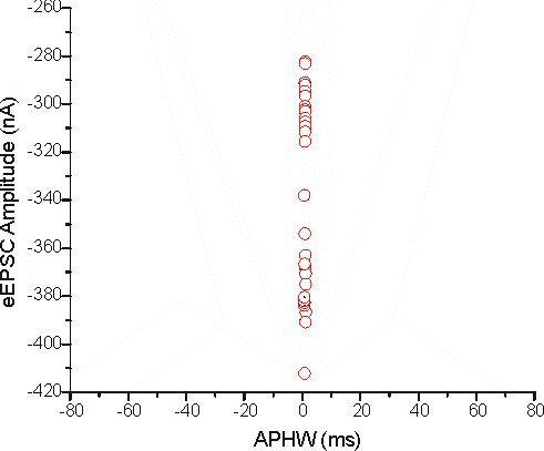
It's pretty hard to see if there are any differences at all in terms of APHW. One way around this problem is to standardise the variables to a common system. If both variables are forced to have a similar range (such as what is seen visually in this graph) the two distances become more equitable.
Scaling (or normalizing) can be done via a variety of means; Z-scores, Range (0 - 1, -1 to 1, 0 - 100%) etc....
There are others, but it would be a waste of time to describe them (just trust me - you don't want to use them).
Z-Scores: This is a way of determining how many standard deviations away from the mean is the value of a variable for a cell (the mean will be derived from all the values for a variable).
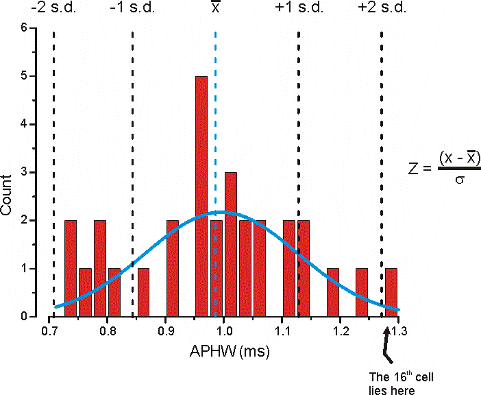
The mean APHW for all of the cells is 0 = 0.98633 ms and the standard deviation (s.d.) is s = 0.14257 ms. The Blue Line is from fitting the data to a single peaked Gaussian function.
The z-score for the 16th cell whose APHW is x = 1.27695 ms (see data here) would be:
z-score = (1.27695 - 0.98633)/0.14257 or 2.0384 indicating this is approximate 2 standard deviations from the mean (these values can either be +ve or -ve).
Replotted after normalization the data would look like this:
It looks pretty similar to this graph, except now the scales are comparable so that each variable contributes more equally to distance measures.
Using the same example points seen above the Euclidian distance between them is now:
x21 = 1.72378, y21 = -0.81854
x22 = 1.40765, y22 = -0.92741
(x22 - x21) = -0.31613 & (y22 - y21) = -0.10887
And the Euclidean distance is now = 0.33435; after converting to z-scores you can see that APHW actually dominates the difference between these 2 points (not eEPSC amplitude as seen above).
This number more closely matches what we see in the graphs. These 2 points are further apart in the x dimension than in the y dimension.
Range: This is somewhat analogous to normalizing by z-scores, but rather than using the standard deviation of the data as the normalization factor the range of the data is used (RN = range normalization score).
RN = (x - xmin)/(xmax - xmin)
There's subtle differences between these two methods, but I wouldn't worry about it too much; just use one or the other consistently (I prefer to use Range Normalization).
Most statistical programs can perform this function for all possible combinations of cells automatically, outputting a distance matrix. To do this in SPSS (I'm using v12.0 for windows): Analyze → Correlate → Distances
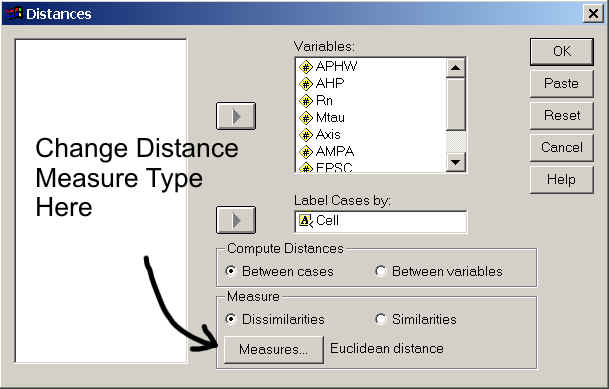
You do not have to have a variable column with Cell (case) labels in it, but if you do you have to have that variable in string format. To see how to change a variable column to string format click here.
Go to the next page to see what a proximity matrix looks like.